Toolbar Customization
Motivation#
As it turns out, various RichContentEditor consumers have different customization needs. On other hand, it is important to keep the public API clean, while providing the desired customability. In order to meet these requirements, the RichContentEditor exposes config object prop.
This document focuses on a specific config API getToolbarSettings that is responsible for the toolbar customization.
getToolbarSettings API#
Signature#
The getToolbarSettings is defined as follows: { textButtons, pluginButtons, pluginTextButtons } => Array<Setting>
The textButtons and pluginTextButtons parameters are objects of the following structure:
The pluginButtons parameter is an inline-button data array (see divider plugin inline-buttons for reference).
The Setting type is defined as follows:
buttonKey represents the current button. for example, one of the values of FORMATTING_BUTTONS that can be found in consts.ts('Bold', 'Italic', 'LINK', etc..).
As you can see, the Settings is form-factor aware, i.e. it defines different behaviors for desktop/mobile views.
Toolbar types#
The following toolbar types are available:
- Text editing toolbars:
- Static text toolbar
- Inline text toolbar
- Mobile toolbar
- Plugin insertion toolbars:
- Side toolbar
- Footer toolbar
- Plugin functionality toolbars
All the toolbar types are exposed by the TOOLBARS const found in consts.ts.
Customizing Text Toolbar Button Icons#
In order to use custom button icons in the text toolbars, you can use the TOOLBARS.TEXT type (this will affect all text toolbars) along with a getIcons function that returns a map of button names to React Components, such as:
All available button names are listed in the EditorPlugins file under the getToolbarSettings section.
Settings properties#
| property | description | affected toolbars |
|---|---|---|
name | one of the toolbar types (see TOOLBARS const for details) | all |
shouldCreate | determines whether the toolbar should be created at the first place | all |
getVisibilityFn | toolbar visibility function | all |
getPositionOffset | toolbar offset point in pixels, relatively to the default toolbar position | all |
getDisplayOptions | toolbar display options (see next section for details) | all |
getToolbarDecorationFn | component to be rendered instead of default toolbar container (see the following sections for details) | all |
getButtons (1) | a list of the toolbar button components | plugin insertion and functionality toolbars |
getButtons (2) | a list of inline button names | text editing toolbars |
getTextPluginButtons | a map of inline buttons added by plugins. The keys are derived from the PluginTextButtonMappers -- see the link-plugin's createLinkToolbar for reference | text editing toolbars |
buttonsOverrides | a map of buttons to override the default buttons configuration | all v2 toolbars |
Display Options#
At the moment, the getDisplayOptions API consists of a single property displayMode. This property accepts two values (defined in consts.js):
DISPLAY_MODE.NORMALis the default; the toolbars are normally-positionedDISPLAY_MODE.FLOATINGthe toolbars are in fixed position. This, combined withgetVisibilityFnandgetPositionOffsetproperties, causes toolbars to "float".
Note: while in DISPLAY_MODE.FLOATING mode, the getPositionOffset property denotes absolute screen coordinates.
Toolbar Decoration#
Sometimes, a static theme is not enough. For example, consider the case when the inline toolbar is required to display a "chevron" right above the selected text.
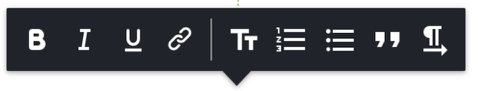
Such behavior involves multiple dynamic values to be calculated within toolbar rendering.
So, the getToolbarDecorationFn comes to rescue. This function is expected to return a Component to be rendered instead of the default toolbar container. This Component will be provided with the toolbar container props. For reference, check out the InlineToolbarDecoration.jsx
Plugin functionality toolbar customization#
The getButtons property, when applied on TOOLBARS.PLUGIN, will affect ALL the plugin functionality toolbars. This can be used, for example, to hide size-related buttons for all the plugin toolbars.
Hiding Buttons#
In order to hide a specific button in a specific plugin toolbar, please use the config.plugin_type_name.toolbar.hidden property. For example, to hide the Replace button of the video-plugin toolbar, the following config should be provided to the RichContentEditor:
The hidden value is expected to be a string array, where every string is the plugin toolbar button keyName.
Customizing Button Icons#
In order to replace a button icon in a specific plugin toolbar or to replace the insert button of a specific plugin, please use the config.plugin_type_name.toolbar.icons property. This is a map of button names to React Components. For example, to replace the Delete button icon of the video-plugin toolbar and the insert button icon of the video-plugin, the following config should be provided to the RichContentEditor:
(the keyName InsertPluginButtonIcon is a generic name for the insert button of each plugin)
References and examples#
The default-toolbar-settings.js contains the default toolbar settings, and the getToolbarSettings code example could be found in PluginConfig.js (commented by default).